
Artwork that prints the way you drew it
Most print problems are file problems, and nearly all of them are visible before anything goes on a press. Here is what we check, and what to send so there is nothing to check.
Delta Media Services Posters & BannersDesign & Logo Creations
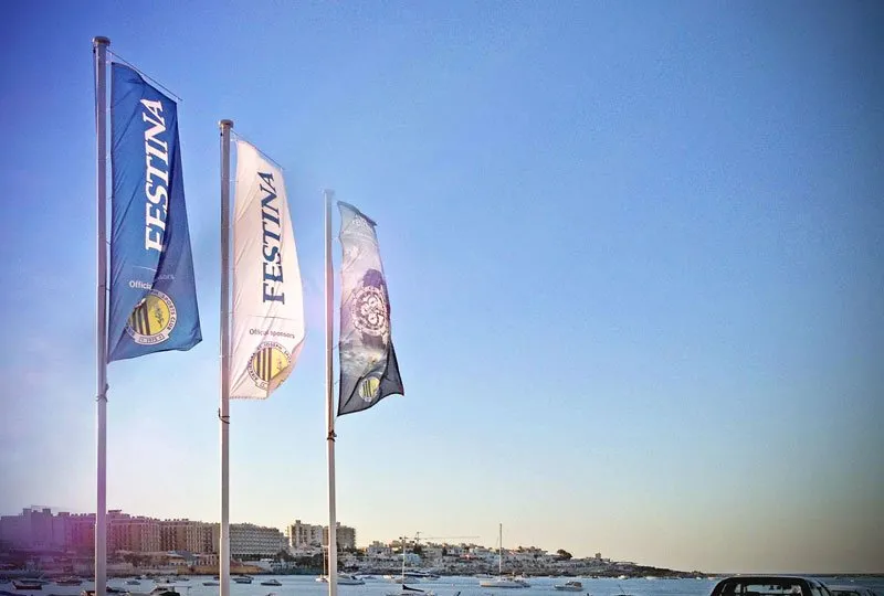
A file that looks right on a screen is being judged at about a thousand pixels wide, backlit, at arm’s length. A printed job is judged at whatever size it actually is, in reflected light, by someone standing close enough to touch it. Most of what goes wrong in print is the gap between those two conditions, and all of it is findable in advance.
Vector or raster — and why it matters
Vector artwork is described as shapes and curves. It has no size of its own, so it can be scaled from a business card to a building wrap with no loss at all. Logos, type, line art and anything cut on a plotter must be vector.
Raster artwork is a grid of pixels. It has a fixed amount of information in it, and enlarging it does not add more — it spreads what is there over a larger area. Photographs are raster, necessarily.
The trap is a logo that has become raster somewhere along the way: exported to a JPEG for a website in 2015 and used from that file ever since. It looks fine at the size it was exported at and falls apart above it. Rebuilding it is ordinary work, but it is work, and it needs to be in the schedule.
Resolution is a function of viewing distance
The familiar figure is 300 dpi, and for something held in the hand — a card, a menu, a booklet — that is the right number.
It is the wrong number for large format. Nobody reads a banner from thirty centimetres, and a three-metre flag at 300 dpi is a file so large it helps no one. What matters is the resolution at the distance the job is read from, which is why we would rather be told what the piece is and where it is going than be sent a number.
Bleed and safe area
Two rules that solve most trimming complaints:
- Bleed — extend any colour or image that reaches the edge about 3 mm past it. Guillotines and plotters have a tolerance, and bleed is what stops that tolerance showing up as a white hairline down one side.
- Safe area — keep text and anything that must not be clipped about 3 to 5 mm inside the trim. A page number sitting 1 mm from the edge is a page number that will be cut off some of the time.
For a wrap or an applied graphic, the equivalent is knowing where the panel gaps, handles and recesses fall — a design drawn as a flat rectangle does not survive contact with a van.
Colour
Screens are RGB and emit light. Print is CMYK and reflects it. The two gamuts are not the same shape, so the most saturated screen colours — a fluorescent green, an electric blue — have no CMYK equivalent and will come back duller than the file looked. This is physics, not a fault in the file or the press.
Where an exact colour matters, and for a brand colour it usually does, name it as a spot rather than trusting a conversion. And accept from the start that the same brand colour on coated stock, uncoated stock, a vinyl and a woven fabric will not be identical — different substrates absorb ink differently, and matching across them is a judgement, made with samples.
Fonts
Outline your type, or supply the font files. A PDF that references a font nobody at this end has will be silently substituted, and the substitution is usually only noticed after the job is printed. Outlining removes the possibility entirely — but keep an editable copy for yourself, because outlined type cannot be corrected later.
What to send
- A print-ready PDF, with bleed and crop marks, fonts outlined or embedded.
- The vector source for any logo or line art.
- Original photographs at full size, not versions that have been through a messaging app.
- The dimensions, the quantity, and where the piece is going to live.
If some of that does not exist, send what you have and say so. Fixing a file at the start is a small job. Fixing it after a run has printed is a reprint.
Depending on the project and the artwork we will advise on the best method for the job, whether the design is complex graphics, high-quality photography, or full-colour work with a lot of colours in it. That advice is easier to give early.